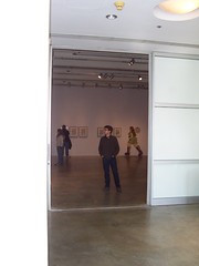

 (Photos by Aaron Igler, from the ICA website)
We drove up today, had excellent cheesesteaks (is that one word?) at University City's Abner's Cheesesteaks, and then walked around the UPenn campus to the Institute of Contemporary Art for the last day of the R. Crumb's Underground exhibit. They didn't allow us to take pictures, but there's some on their website. The exhibit was originally curated by Todd Hignite and "coordinated at the ICA by Associate Curator Jenelle Porter."
The exhibit, which closed today, was fantastic... or at least the artwork was. The exhibit proper I was less happy with. Pieces were arranged in orders that weren't apparent - neither historical, nor by purpose, nor by media. Judging from the 4-page handout, which says, "Rather than a chronological retrospective, this career-spanning exhibition is organized around specific underlying themes and ideologies" which it then lists as 'Young Crumb,' 'Crumb Draws Crumb,' 'Counterculture,' 'Collaboration,' and 'Old-Time Tunes.' However none of the sections of art in the two cavernous rooms were labeled with these headings, nor were the brief descriptive paragraphs on the section in the brochure included in the actual exhibit. The pieces, except for those published in comic books, were frequently only labeled with the title and media so one could not necessarily place them in context. I happened to recognize two of his New Yorker strips done with his wife Aline, but many other viewers less familiar with his work wouldn't have known where "Fashion Week in New York" and "Cheering Global Villagism" were done for, facts that are relevant in terms of the lessening of some of Crumb's more scatalogical tendencies in the two strips. Interestingly, the artwork was uncolored which was something of a surprise to me as it appears in color in the magazine - my companion and I wondered if Crumb supervised the coloring or if it was done on a computer without him. Crumb's color New Yorker cover of Eustace Tilley as a young punk was included in the show, again without its publication information.
 Entrance to exhibit
In spite of these cavils, the exhibit was filled with fantastic pieces, many loaned by Eric Sack. Included were napkins from restaurants that Crumb drew on, which have been the subject of several of his recent books, an Oog & Blik comics publisher's folder he drew a self-portrait on, the back cover of Zap Comix 0, "Early Jazz Greats" watercolor on paper paintings for a card set, his Patton strip which was also in the Masters of American Comics exhibit, Little Wonder Hot Book (1969) - a minicomic with Spain and S. Clay Wilson, original Mr. Natural pages from 1968-1969, the metal printing plate from Zap Comix 0, "Angel Food McSpade" and "Meatball" strips from Zap, and pages of jam comix and posters. A small case of published versions of his art included Zap Comix 1, 0 and 2, Help, Gothic Blimpworks, an American Greeting Card "Season's Greetings" from 1965, and 3 specimens of the unpublished comic he created with his brothers (as seen in the Crumb film).
More art highlights included a complete Fritz the Cat story from 1965, a 1987 Christmas card by Crumb, his wife and daughter, a CBNDI Belgian comics museum poster original and a sketchbook circa the 1960s. One wall had original artwork for comic book covers including Arcade #3 with a pasted-in Zippy by Bill Griffith and the book, R. Crumb's Head Comix. Crumb's work was generally only slightly larger than the published version and he seems to usually work 1 1/2x up. His style evolved somewhat during the 1960s, but by the end of the decade he'd settled into essentially the same one that he uses today although it's obvious that he takes more time and effort on his art now. Much of the material in the show came from a fine art gallery that presumably sells the artwork for him.
The exhibit was a fantastic overview of Crumb's career, even if sadly lacking in information on him. This trend towards treating comics artists solely as fine artists seriously misinterprets the essentially commercial component of comic book publishing, even in the undergrounds that Crumb worked in. However, anyone who likes his work would be well-advised to see the next site it travels to. The exhibit, as stated, was accompanied at the ICA by a four-page brochure and a poster was available for purchase.

3 comments:
Sounds like a great show
Wish I could've been there.
Yes, it was good art.
We missed you too.
Post a Comment