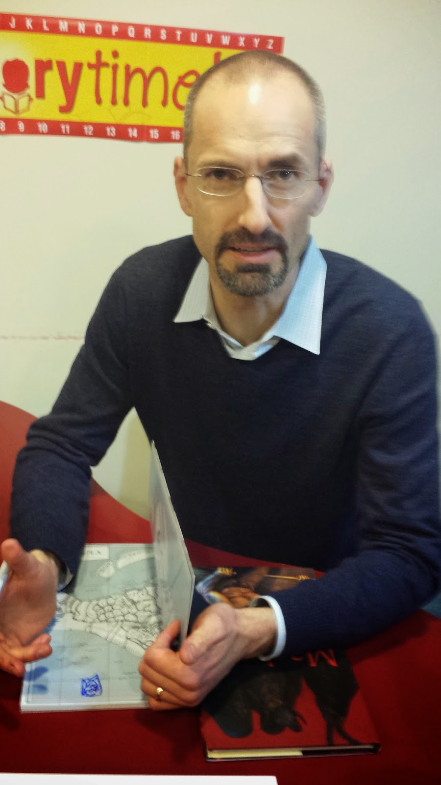
by Mike Rhode
 Gareth Hinds
 recently answered my
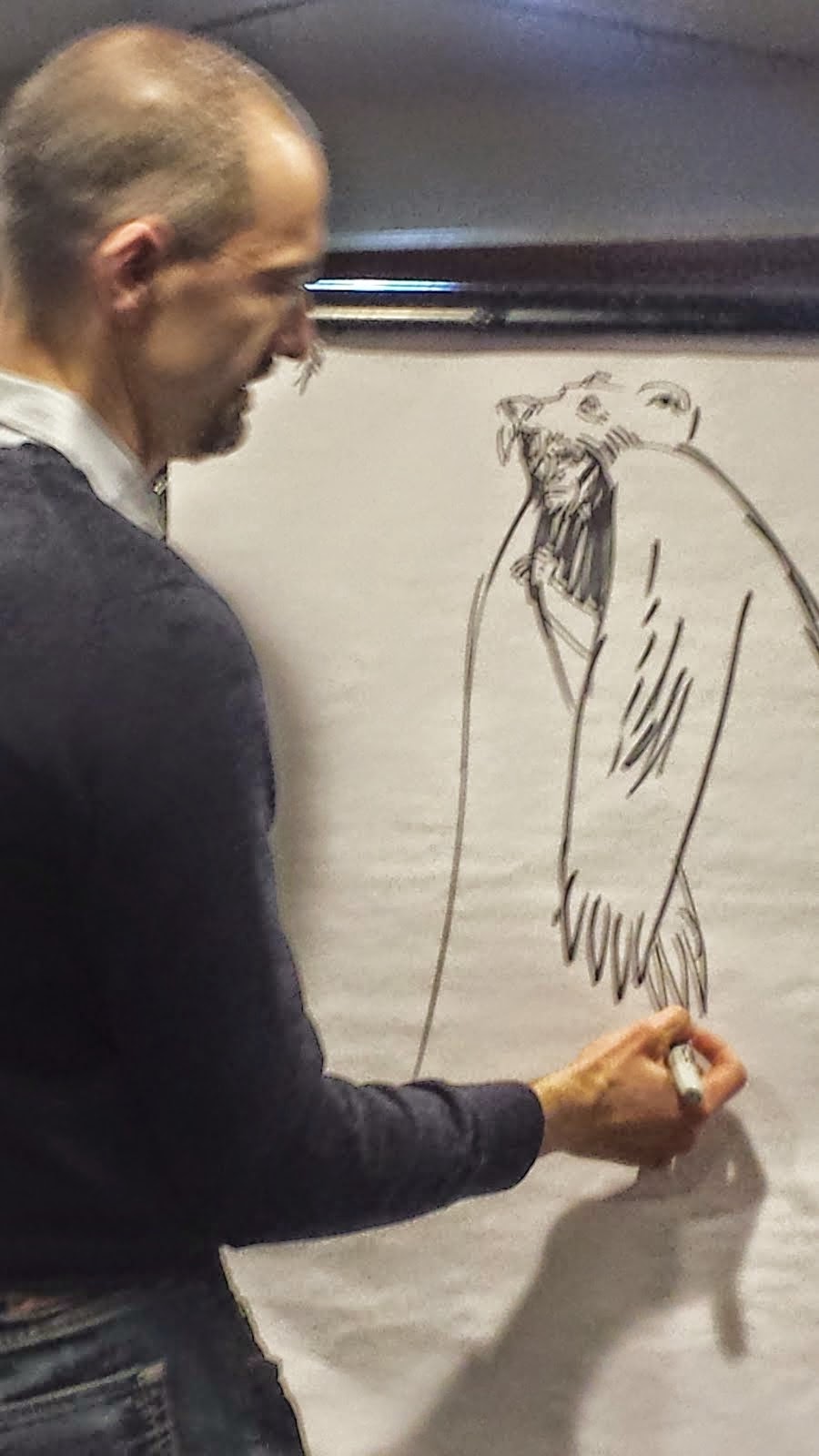
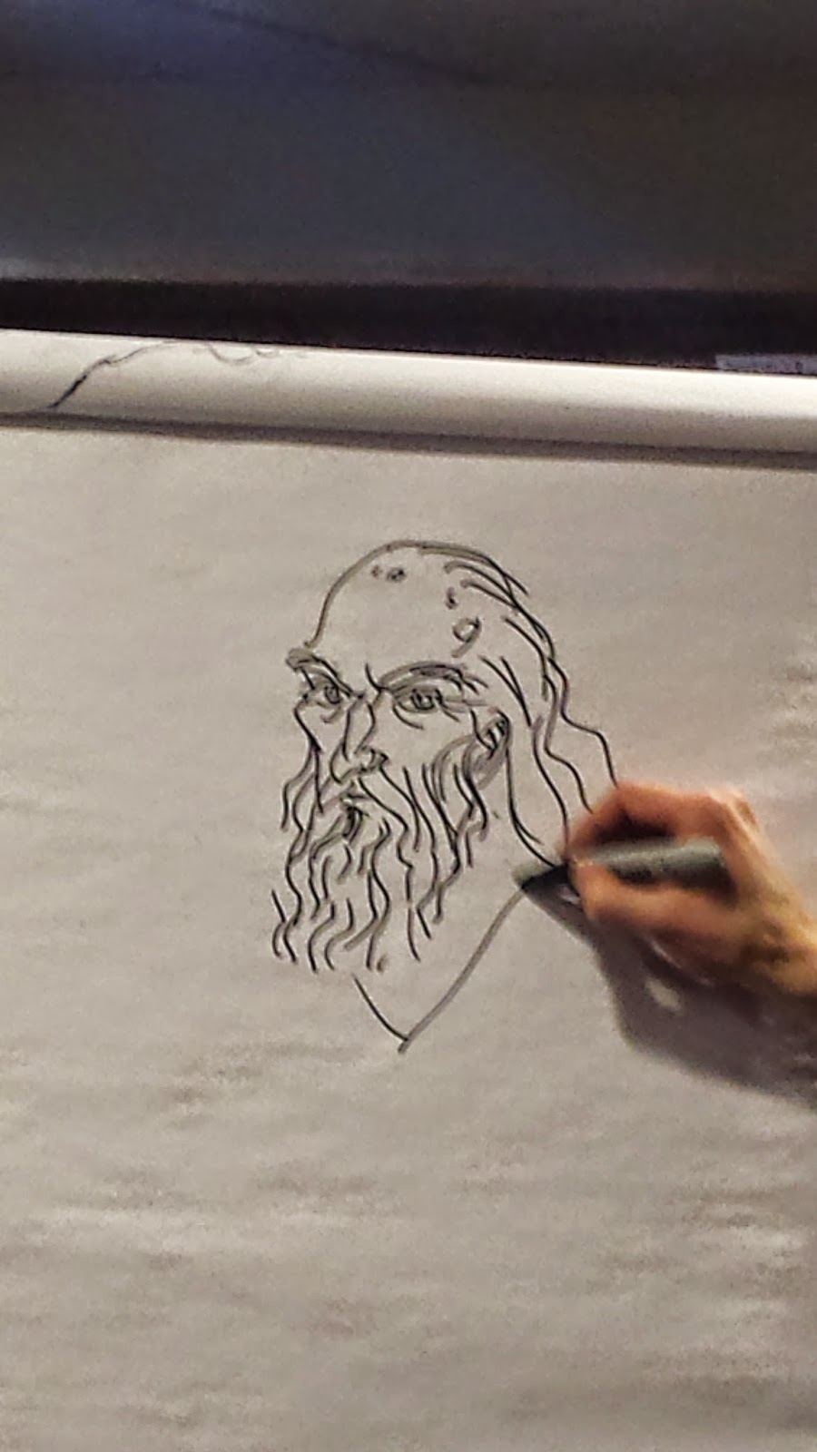
usual interview questions, but a few days later I was lucky enough to attend his 'chalk talk' at
Hooray for Books in Old Town Alexandria. With 45 minutes of speaking and drawing, he covered much more ground than the basic interview questions, so I transcribed highlights of the talk, and illustrated it with photographs.
(More can be found here).
Hinds’ first graphic novel was a thesis project at
Parsons School of Design. It was about a man who made a deal with the devil and
wore a bearskin. The story is one of the more obscure Brothers Grimm fairy
tales. “I took this fairy tale which is only two pages long in its original
form, and did most of the storytelling visually, with very few words in it, and
so it ended up being an 80-page graphic novel. I didn't finish it until after I
was out of school.” The Xeric Foundation gave him a grant to self-publish
Bearskin which came out in 1998. “That
was my opportunity to learn how publishing worked, and all the different parts
of putting a book out – how to get it ready for press, how to write press
releases, how to get distribution and get it in stores…” Hinds then worked in
the video game industry for a decade, doing all types of art including
character design and 3-D modeling.

His next book was “closer to the mainstream of comics, which
is to say the superhero genre, and is about a warrior who has the strength of
thirty men and goes around fighting monsters.” That was
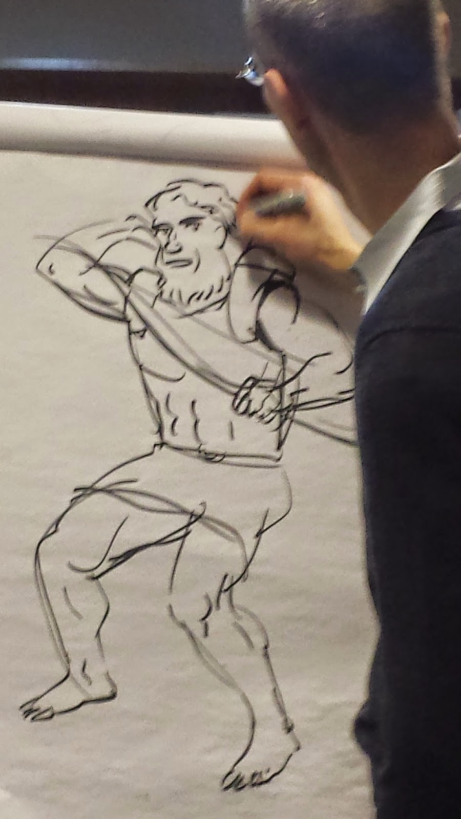
Beowulf. “When I’m drawing a graphic novel, the first thing I do is
sketch it out very rough. I now do these rough drawings digitally, and then I
would do a finished drawing with traditional materials. I would transfer my
digital drawing onto a piece of watercolor, or other heavy paper and do a
finished drawing on top of it.” “I chose to draw Grendel as metallic, because
in the story it says he’s immune to weapons, and that’s the reason Beowulf had
to wrestle with him and not fight him with a sword. In the battle scene in my
book, I have him wearing hand wraps, almost like he’s a boxer getting into the
ring.”
Candlewick Press contacted Gareth and expressed interested
in reissuing Beowulf and doing his next book. “I had started both King Lear and The Merchant of Venice. Together we decided that I would finish Merchant first for Candlewick; I would
self-publish Lear, and they would
reissue it later. It was a weird transition, going from self-publishing to
having a publisher.” The characters in Merchant "are all based on real people. This book has more of a modern look to it.
I decided to set this in modern-day Venice for a couple of reasons. One was so
I could draw all the characters and the locations from life. The other reason
is because of the anti-Semitism in the play which is a big deal. The bad guy of
the story is a Jewish moneylender. I didn't want to gloss over it, and by
setting the story in the modern day, it actually throws it into starker relief
and makes the readers ask themselves if this is something we’re still dealing
with. The particular form of anti-Semitism seen in this play we don’t have
quite as much of, but we definitely have high levels of religious intolerance
that are still causing problems."
“My
King Lear is
another visual experiment where I played around with breaking the action out of
the panels and letting the characters walk around on the page as if it were a
stage. The characters leave little trails and there’s also little trails
connecting the balloons so you know what order to read them in. And then those
little trails become the wind that becomes the storm.”
“I wanted my Lear to be really, really old. It’s always a
question about how old these characters are in these stories. Shakespeare often
doesn’t tell you exactly. I decided to make him quite old, but also still very
hale. He clearly was a very strong fighter when he was young, and he still
thinks of himself that way. He goes around blustering, and occasionally
punching people. His costume is almost like a sheet. One of the things I liked
was the idea that maybe he is really mad, and all of the action is occurring in
his own mind, and maybe he’s an escaped mental patient and this is his hospital
gown. I had this idea when I was walking into the subway station and I saw this
guy who looked like King Lear, and thought it would be cool if Lear was a
homeless guy who was having hallucinations.”
“My Lear is still muscular, but he’s gotten thin and old. I
enjoy drawing muscular old men. The younger and prettier a character is, the
more difficulty I have drawing. After King
Lear, he adapted the Odyssey. “The Odyssey was my favorite classic when
I read it in school. As soon as I was done with Beowulf, I planned to do the Odyssey,
but it was a major undertaking so I had to wait until the right time. Odysseus
is a fascinating character; he’s an awesome hero. He’s strong and smart, and
usually wise, but he has some flaws. He’s also an unreliable narrator. He’s
telling you the story and you know that he lies. You see him lie all the time.
So how much of his story is really true?”
“Most of what armor and clothing survives is from later
periods of Greek history, but there’s a lot of vase and pottery paintings and
often the paintings are subjects from Homer’s Iliad and Odyssey.” While
discussing his decision to make Odysseus an ambidextrous archer, Hinds
digressed to note, “Right now, I’m working on some illustrations for a
non-fiction book about the famous samurai Yoshitsune Minamoto, and in that
period samurai primarily fought with bows. I thought there’s an interesting
parallel. Minamoto is actually a lot like Odysseus. He’s a warrior who uses his
wits just as much as he uses his physical prowess. They’re both master archers.
It would be fun to see them both in battle leading armies.”
“My Odysseus is a little older than most people picture him.
While I am adapting a text, I spend a lot of time doodling. I’m visually
brainstorming. I might draw 20 or 30 different versions of a character, before
I decide which one I want. Sometimes I have a definite idea in my head for the
main character. I didn’t draw a million versions of Odysseus; I pretty much
knew what he looked like. Other times, like Lady Macbeth, I drew lots and lots
of versions.”
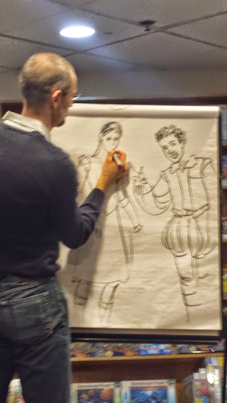
Romeo and Juliet
was a challenge to draw, because all the characters were young and attractive.
“This is a good example of character design. Not only was I drawing lots of
different versions of the characters, but Shakespeare has been reset and
restaged in different time periods and cultures, so I had a lot of options.
However, I’m also aware that a lot of my market is teachers and students, and
they want some understanding of historical context. I decided I was going to
keep this in historical Verona, but I was going to make the characters
multicultural and a little more modern. Tybalt has tattoos. Everybody’s wearing
boots instead of slippers. The women have their dresses cut at the knee instead
of the ankle. There’s a lot of liberties that the young characters are taking
with their costumes and the social conventions of the time period.”
“I decide Romeo would be this young, attractive guy who has
little dreadlocks. Mercutio has big crazy dreadlocks. Everybody’s got poofy
shirts. They’ve got big poofy tops on their pants. Juliet also wears boots
which is definitely not something you would have historically seen. She’s got a
Renaissance-style sleeve. She’s Indian, he’s African. They’re about the same
height.”
When starting a book, “I will start laying out pages. Often
the very first spread is a big title page. For
Macbeth, I knew right away I
wanted to show an island with a castle and water. Next, I started drawing the
page where the witches are talking. I might not have finalized the designs and
won’t draw any details on the characters. When I used to do this on paper, I
drew word balloons with an approximate amount of text. Now digitally, I can see
exactly how much room the text takes up which is very important for the
dialogue-heavy pages where characters are talking back and forth and I have to
make sure the page fits together. I play around with different compositions at
this stage. I will draw three or four versions of a page; I might even draw ten
versions if I’m having trouble with it. I’ll draw the whole book out in that
form and show it to people including my editor. I’ll read it myself over and
over, looking for places where I can make it more dramatic or clear. Those are
the two main things: it’s got to be clear and it’s got to be dramatic. Those
are the things I’m looking for in my rough layouts. Then I draw the finished
line art for the whole book. No color, but all the detail. Typically I’ll get
another round of feedback before I get color, but sometimes the color helps
people see what’s going and identify issues.”
“When the final art is done, it’s scanned and dropped back
into the digital page layout program I used for the rough sketches, and then
all the panel borders and speech balloons are added digitally on top of the
artwork so that everything is nice and clean. More importantly if anything has
to change – if a balloon has to be made bigger or smaller because the text
changes – that can be done very easily without touching the artwork.”
“I draw a lot out of my head, but sometimes if a pose is
tricky, or the drawing isn’t coming together, I will get a reference. Often
what that means is that I’ll pose myself, in a mirror or using my webcam.
Sometimes if it’s a female character, I might ask my wife to pose, or look for
a photo on the web, or get friends to pose as they did for all of Merchant. I don’t go shot for shot with
photographs the way Alison Bechdel does; I would say I probably need reference
for every third or fourth panel.” Hinds’ wife noted at this point that she came
home one day and found him wearing a toga-like dress and posing, but he won’t
let her show the photograph.
When it comes to deciding what book to work on, Hinds says,
“It’s mostly me. I typically go to the publisher with a couple of options, and
they’ll either pick one or ask which one I really want to do. They’ve been
pretty good about it, but we’re both concerned about the market. They’ll ask if
a book is being taught much. I picked
King
Lear because it was one of my favorite of Shakespeare’s, but it’s my least
successful books, I think because nobody teaches or reads it in high school.
Conversely,
The Odyssey is my most
successful, so we’re always looking for the next success.
Romeo and Juliet and
Macbeth
are arguably the books I should have started with because those are taught all
the time. The publisher doesn’t come to me, but I do get a lot of requests from
teachers. Generally the publisher has been happy to do the next thing that I
want to do. The next project, after the samurai book, is Edgar Allen Poe’s
Stories and Poems.”
When asked about all the pre-existing graphic adaptations of
Poe, Hinds noted, “I worry about competition if I feel that somebody has done
it well for the educational market. I don’t feel that anyone has done Poe well
for that market. There’s some pretty good stuff, but it’s mostly black and
white, and there’s some silly spins, which is entertaining but is not what
teachers are looking for.”
“People often ask me if I’m going to do any original work.
Between projects, I take a couple of weeks to a couple of months to write
because I like to write and I have ideas for stories. I’m pretty critical of my
writing, and like most writers I find that process can be hard and take a
while, so I usually decide I need to be drawing. Eventually one of those
projects will probably take off.”
When asked if he would illustrate a book written by someone
else, he noted that the upcoming samurai book fits that, as an earlier
children’s book, Gift from the Gods,
done in the style of The Odyssey. “I’m
always happy to do more of that in picture books. I don’t know if I would
illustrate somebody else’s graphic novel because it so much work that I don’t
know if I want to invest that kind of energy. In my ideal world, I would do a
picture book in between every graphic novel. That would be a nice break. A
graphic novel takes me about a year. The
Odyssey is twice as long and took about 20 months.”
Regarding translations, the most recent are copyrighted, so
how does he pick which one to use? “For
The Odyssey, I was trying to decide
which one to use, but I realized I was putting the cart before the horse. I
need to start trying to write the script, and as soon as I did that, I realized
I would have to completely rewrite it for brevity. I didn’t have to worry about
it too much as long as I wasn’t using direct quotes from the translation. For
Beowulf, both the translations I used are out of copyright. The first one I
chose for my self-published version is by Francis Gummere is very very archaic
and I really like it. My publisher Candlewick thought that one was a little
hard, and asked if I could find another one. If I had been working on that book
after Seamus Heaney’s translation came out, I probably would have tried to get
it.”
When asked about writing for the
educational market, Hinds said, “It’s kind of just where I landed, but the
thing that feels really good is when I hear my book helped somebody get through
a work they wouldn’t have otherwise read, and helped them enjoy it. That’s the
big thing to me. I enjoyed them when I read them, but I know a lot of people
don’t. I want to share the experience of finding the stories to be cool. In a
perfect world, I would also would also sell really well in a comics store, which
is the world that I came from. But it’s completely different distribution, and
aesthetic. Comics purists don’t like typeset books – when I go to comics
conventions, I’m this weird animal that’s neither fish nor fowl. I seem to fit
more naturally into that young adult and school library marketplace, but that’s
not necessarily something I picked.”
The samurai book will be out in February 2016, the Poe book
at the end of 2016, and he announced, “I am under contract to do The Illiad
after Poe. I’m going to try to keep it to 200 pages but it will be tough. It’ll
be tough in any number of ways. I do enjoy drawing battle scenes, but it will
be complicated.”


 It's been months since I've had the time to post any reviews, but some new material has arrived in the mail recently and it's prodded me to start again. I'll try to work my way backwards too, even if it's only a brief mention of the book and my thoughts on it. - Mike Rhode*
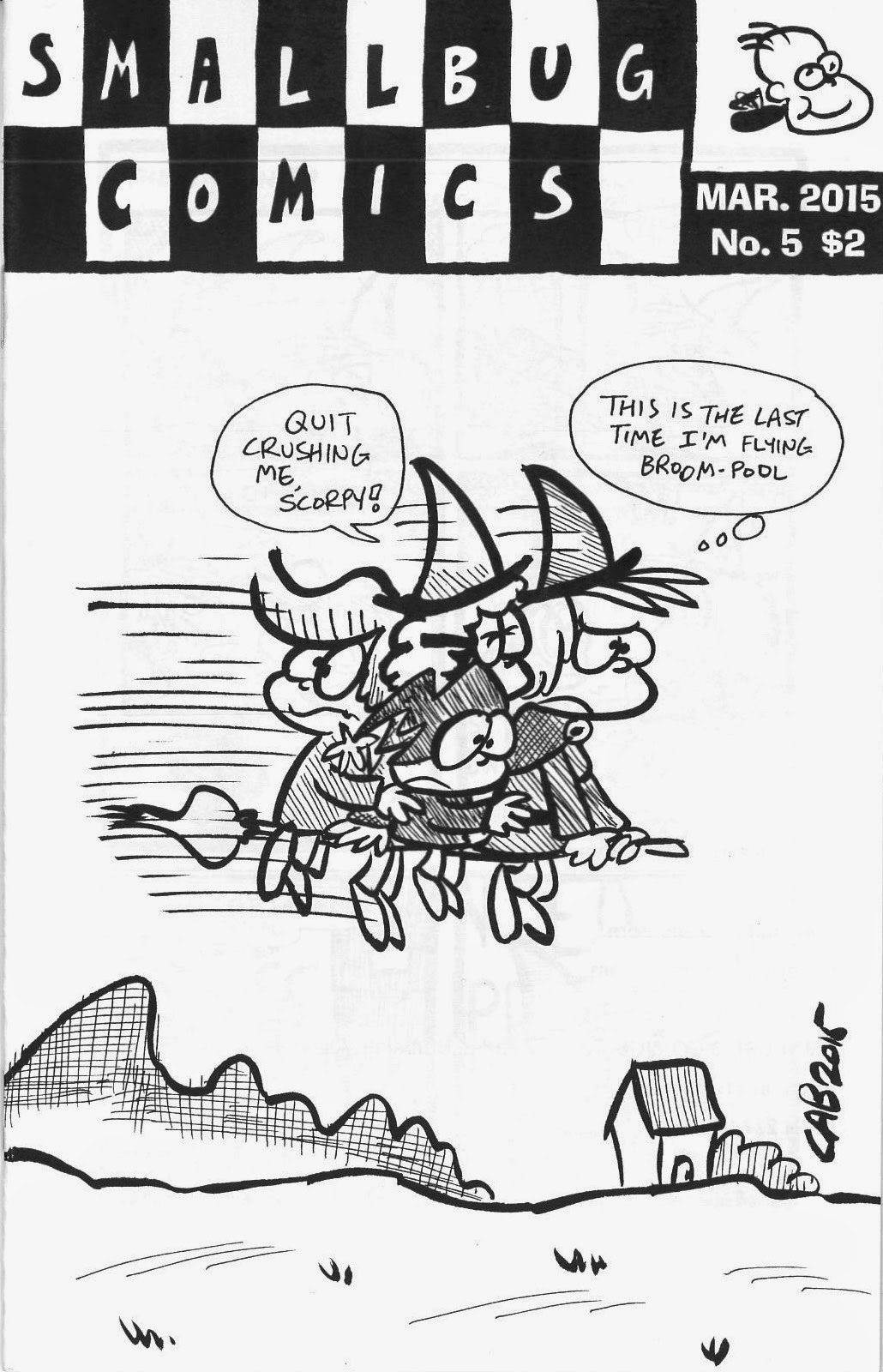

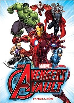 Marvel: The Avengers Vault (Thunder Bay Press, $35) is by noted comic book writer Peter David (who, according to the Grand Comics Database, never actually wrote the Avengers). As a wee lad, my favorite superhero team was the Avengers. I'd been given a copy of Avengers #8, introducing Kang the Conqueror, by a cousin, and I spent the next 25 years buying their comics. I can't really relate to the Avengers-centric Marvel Universe of today, but the movies are well-done and probably a good part of the reason this book exists. And honestly, the kid reading Avengers #8 would have loved this book. The 'Vault' part of the title is "ten collectible pullouts: a Thor poster, concept art for Iron Man,
Captain America's Sentinels of Liberty membership card, original art by
Jack Kirby, and more - perfect for the superfan's bedroom wall." The text of the book is quick summaries of the histories of the Avengers and its most famous members Captain America, Iron Man, Thor and the Hulk. David does a good job of summarizing almost 50 years of comic book backstory for each chapter, including the major supporting characters, and highlighting Marvel's post-Civil War history. Chapter 6 is a brief look at animated television adaptations, and then there's an appendix of Avengers members which splits into teams such as The Illuminati, the New Avengers, and the Mighty Avengers. It's too much for this aging fan's brain, but a tween who likes comics or the movies should love this book.
Marvel: The Avengers Vault (Thunder Bay Press, $35) is by noted comic book writer Peter David (who, according to the Grand Comics Database, never actually wrote the Avengers). As a wee lad, my favorite superhero team was the Avengers. I'd been given a copy of Avengers #8, introducing Kang the Conqueror, by a cousin, and I spent the next 25 years buying their comics. I can't really relate to the Avengers-centric Marvel Universe of today, but the movies are well-done and probably a good part of the reason this book exists. And honestly, the kid reading Avengers #8 would have loved this book. The 'Vault' part of the title is "ten collectible pullouts: a Thor poster, concept art for Iron Man,
Captain America's Sentinels of Liberty membership card, original art by
Jack Kirby, and more - perfect for the superfan's bedroom wall." The text of the book is quick summaries of the histories of the Avengers and its most famous members Captain America, Iron Man, Thor and the Hulk. David does a good job of summarizing almost 50 years of comic book backstory for each chapter, including the major supporting characters, and highlighting Marvel's post-Civil War history. Chapter 6 is a brief look at animated television adaptations, and then there's an appendix of Avengers members which splits into teams such as The Illuminati, the New Avengers, and the Mighty Avengers. It's too much for this aging fan's brain, but a tween who likes comics or the movies should love this book.
 The judges said they "were unanimous in their decision to nominate Kevin Kallaugher, better known to the world as Kal, for the 2015 Herblock Prize. Kal draws cartoons for both the UK-based Economist magazine and the Sunday Baltimore Sun newspaper. His portfolio reflected his dual editorial cartoonist roles, and impressed the judges with his ability to jump between macro international policy issues to Baltimore mayor's stonewalling about the accuracy of its speed cameras. Like Herblock, KAL is a committed defender of civil liberties. His full-page cartoon on Edward Snowden is a minor masterpiece. His artwork, still traditional ink on paper, remains strong in his fourth decade of cartooning. He is a master of caricature. Whether single panel, circular, or multi-panel, his cartoons are clear, thoughtful, forceful and in the best tradition of Herblock."
 by Mike Rhode
 Why are you in Washington now? What neighborhood or area do you live in?
 What work are you best-known for?
 What do you think will be the future of your career?
  What monument or museum do like to take visitors to?


